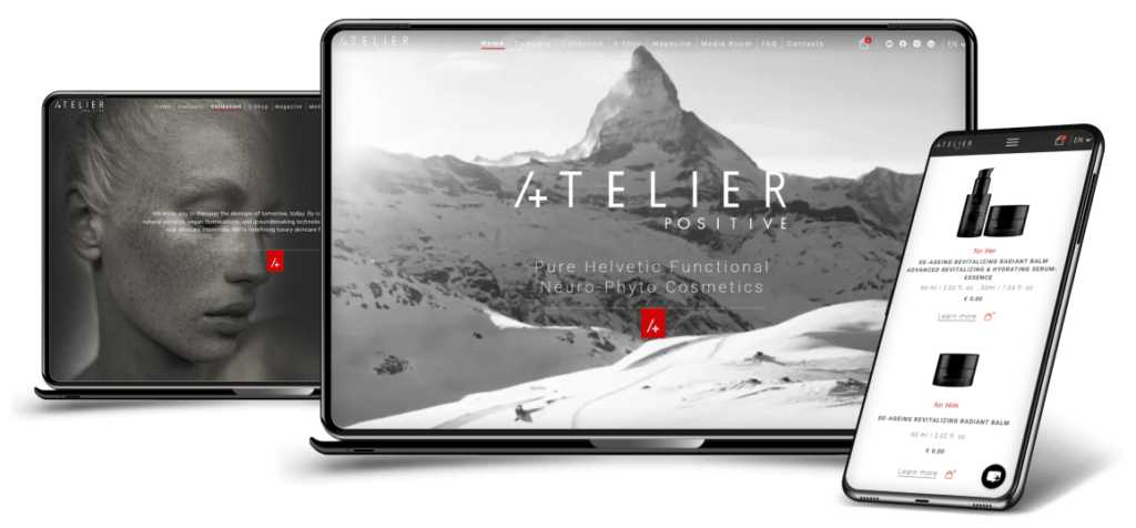
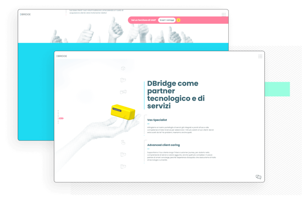
For the global launch of the platform, the client needed a Brand Image and a website that would underline the peculiarities of their offer, the dynamism of their platform, compared to traditional models, and that was impactful and recognizable.
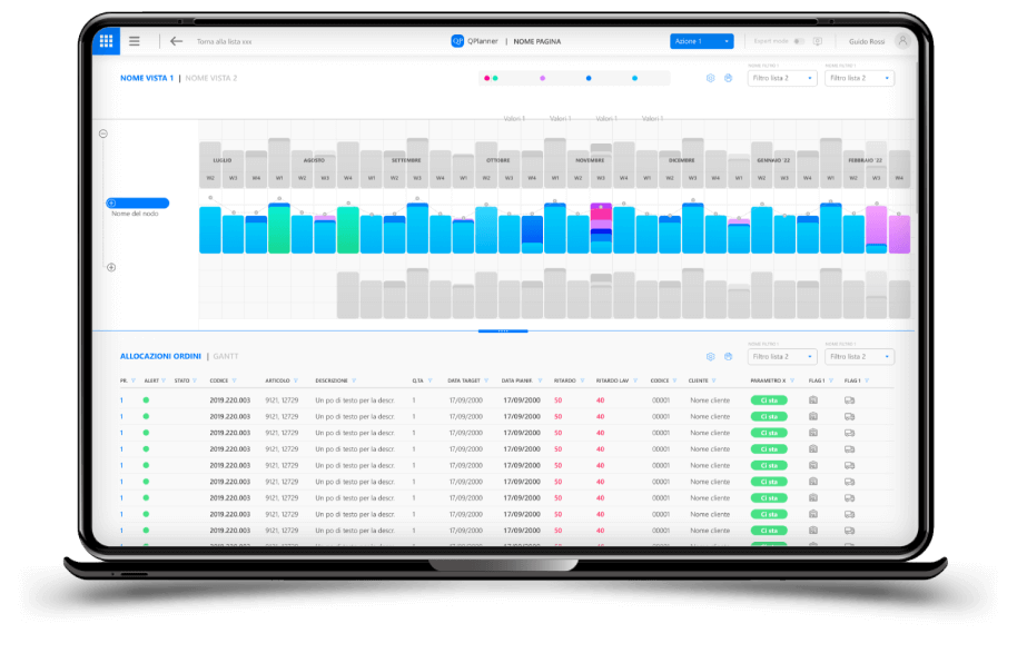
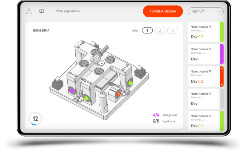
Production line + Easy/clean UI + Clear focus + Quality control
We faced it this way
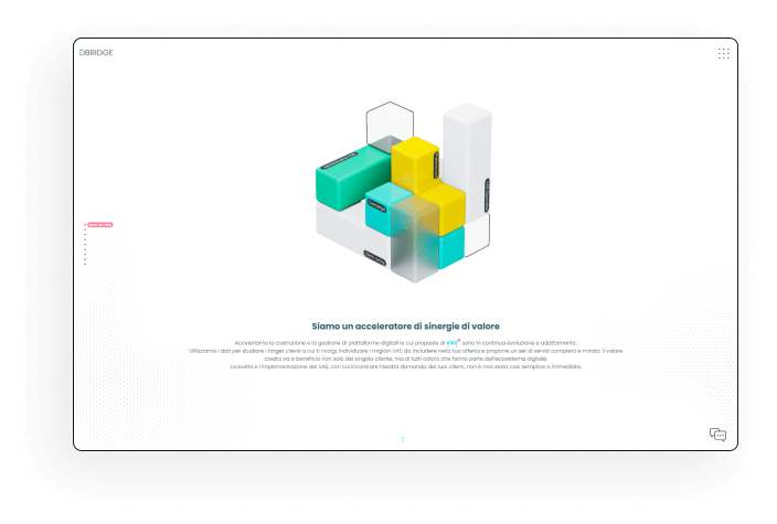
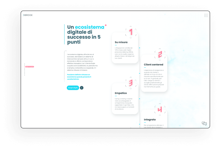
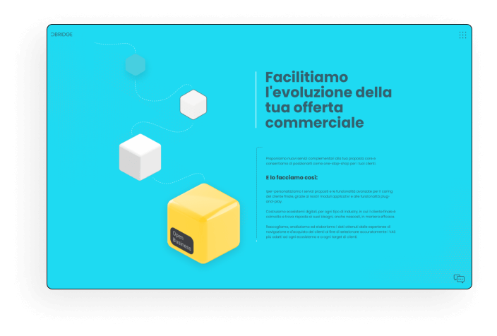
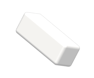
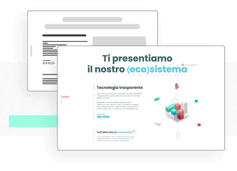
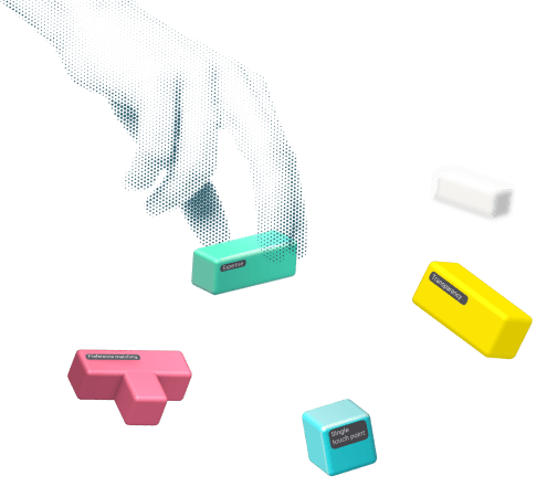
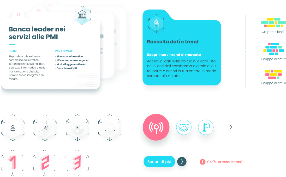
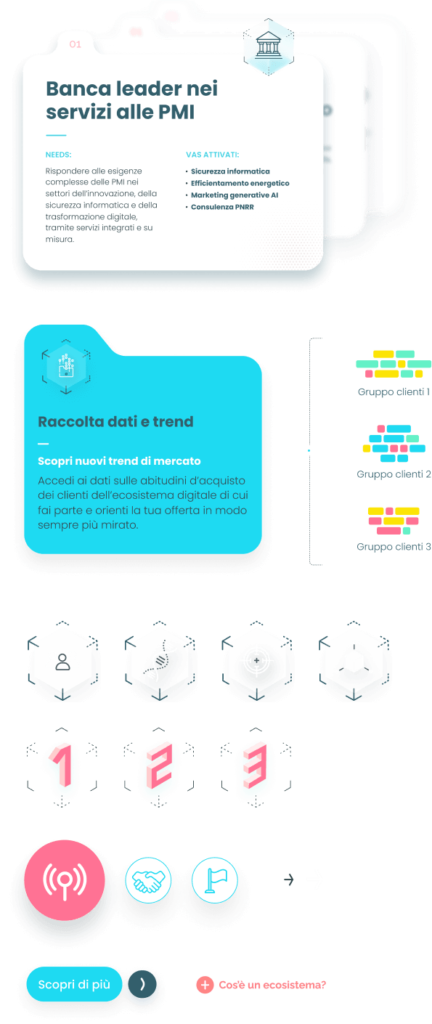
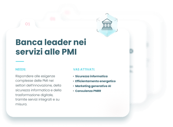
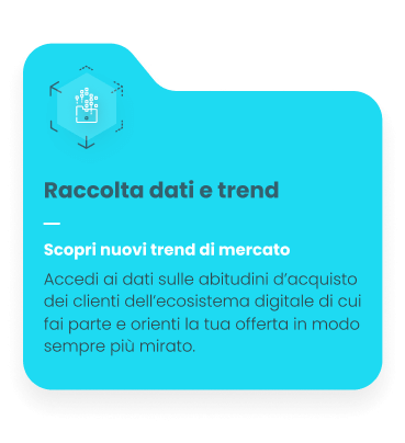
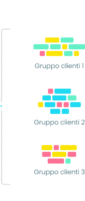
We started from the idea of ecosystem (one of the key points of their offer) proposing a “brick” design and iconography, a playful but clear way to talk about more complex services and systems, born from simple elements that can be configured at will.
Event storming + Incremental development + Continuous improvement
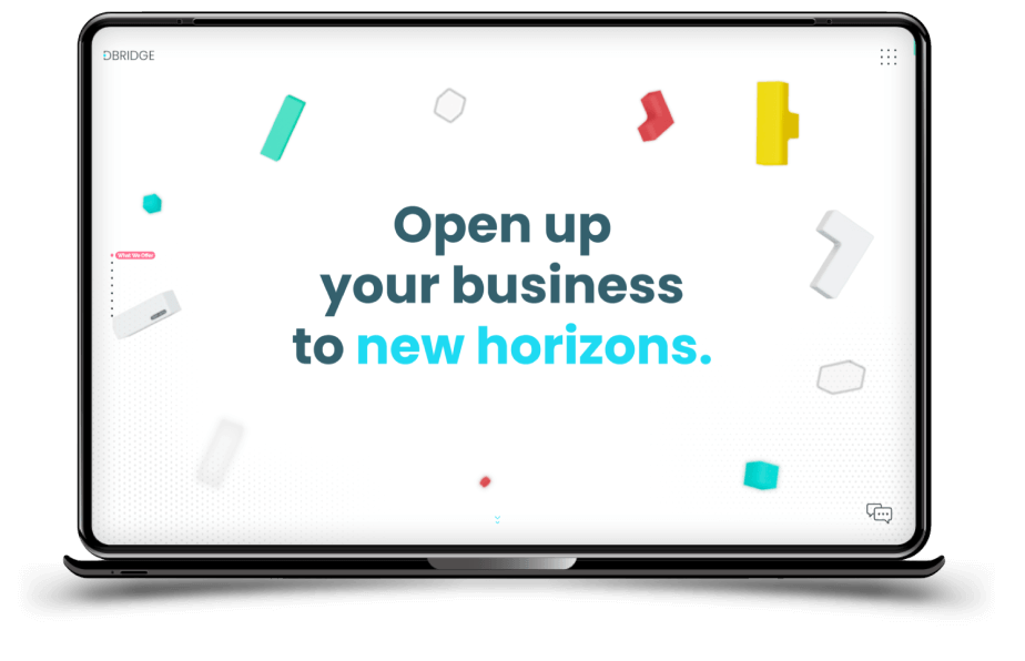
... and this is the result
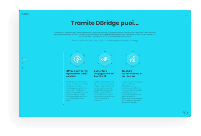
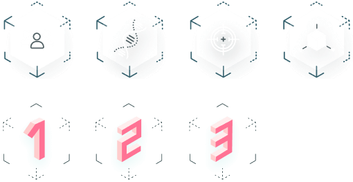
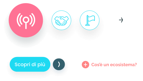
Fresh colors, as fresh as the startup, clear iconography and direct messages. A pinch of playfulness both in graphics and interactions, to talk about a technology platform in a less technical and easier, more accessible and clearer way.
We have also developed templates for company presentations and, in general, designed a Brand Identity that is definitely recognizable.
User flows + Wireframes + Fast Prototype + POC
Design elements:
D6474C
64F1C7
FF809E
FEEC4E
324449
34606D
FFFFFF
Explore a little more
We have accumulated significant experience in developing innovative projects, serving startups, SMEs and large companies. If you don’t believe it, we’re sorry.


 studio
 digital