A well-established alfalfa producer contacted us to design a new line of cosmetic products together. The goal was to highlight the brand’s roots, territory, authenticity, and the natural quality of the new line.
Alfalfa + Territory + Life + Beauty
We faced it this way
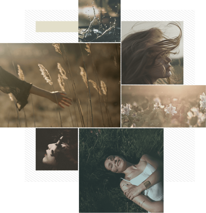
First, we conducted an image research and created moodboards that would strongly influence the following steps, guiding both the verbal and visual language towards values of friendship, pragmatism, love for the land, and a return to a life connected to nature and its rhythms.
Nature + Territory + Belonging + Love
We faced it this way
First, we conducted an image research and created moodboards that would strongly influence the following steps, guiding both the verbal and visual language towards values of friendship, pragmatism, love for the land, and a return to a life connected to nature and its rhythms.
Nature + Territory + Belonging + Love
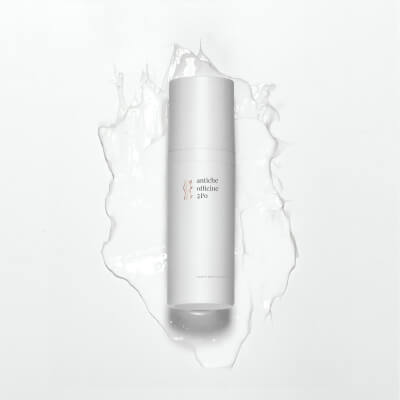
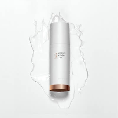
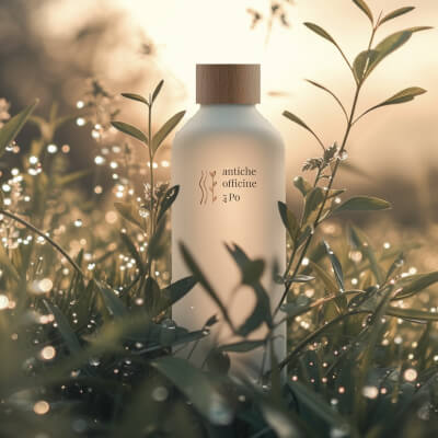
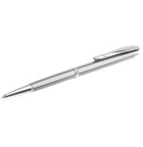
We started with a handcrafted style, almost handmade, a branding that reflected the idea of slow living, natural materials, and the feeling of nature close to the skin.
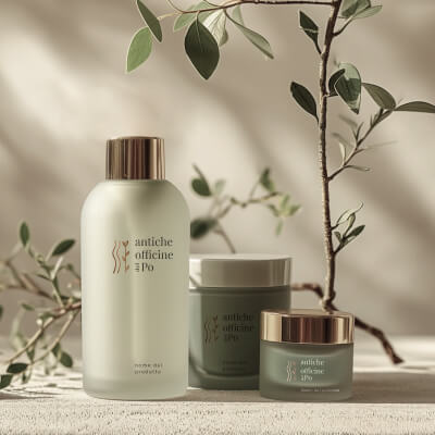
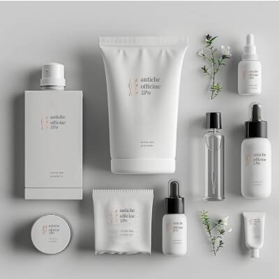
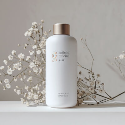
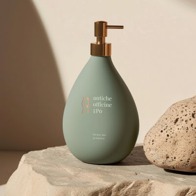
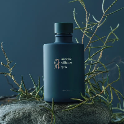
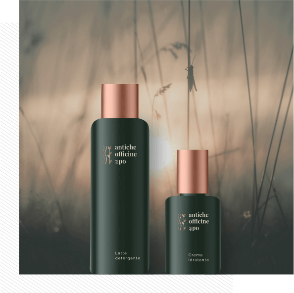
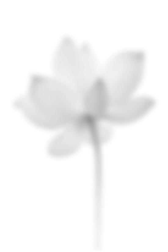
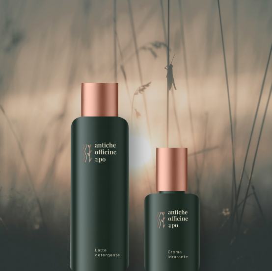
This is the final result, where a hand-drawn symbol evokes the Po River, the place where the client’s alfalfa grows, alongside the sprouting of the plant, which together create life, well-being, glimpses of life from another time, and stories of people who love returning to slowness.
1
The symbolism
The waters of Delta del Po flowing calmly, the alfalfa stems growing in the fertile fields of the Po Valley.
2
The accent of color
A color palette that evokes the earth, enhanced by metallic bronze light reflections to characterize a refined touch.
3
A font with elegance
A font with simple yet finely crafted features, describing the brand with elegance and gentleness.
4
Words that tell a story
A name steeped in history, it expresses the millennial heritage of alfalfa and its importance in the context of medicinal herbs. A symbol of craftsmanship and dedication to the land.
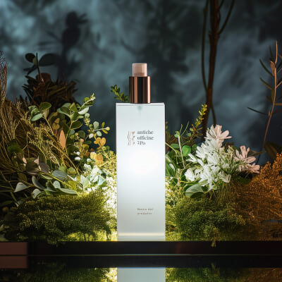
... and this is the result
Un brand che richiama un modo di vivere quasi ancestrale, una scelta etica, profonda, chiara. I colori, la pulizia delle proposte richiama la semplicità, l’essenziale.A brand that evokes an almost ancestral way of living, an ethical, deep, and clear choice. The colors and the simplicity of the designs reflect the essence of minimalism.
Simplicity + Natural + Elegance + Belonging
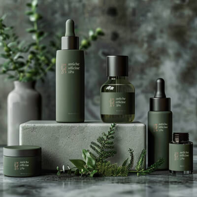
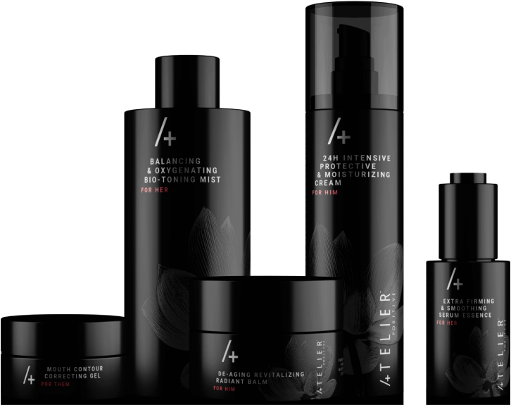
Product concept:
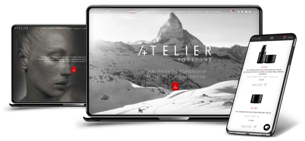
Explore a little more
We have accumulated significant experience in developing innovative projects, serving startups, SMEs and large companies. If you don’t believe it, we’re sorry.


 studio
 digital